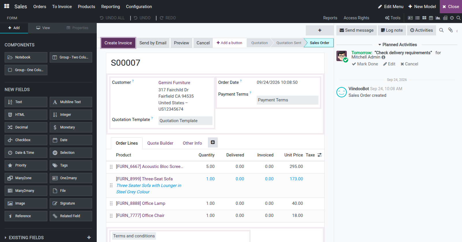

Viindoo Customizer
by Viindoo
| Lines of Code | 24071 |
| Technical name | viin_customizer |
| License | OPL-1 |
| Website | https://viindoo.com/apps/modules/18.0/viin_customizer |
| Read description for | v 15.0 v 16.0 v 17.0 v 19.0 |
| Required Apps | Discuss (mail) |
| Extensions | Viindoo Customizer with Web Responsive |

Shape Odoo around the way your business works - no code required
Viindoo Customizer lets administrators redesign screens, add fields, build new apps and lay out printed reports directly on the live interface. What you see on the canvas is exactly what your users will see.
Works on Odoo Community Edition and Viindoo.
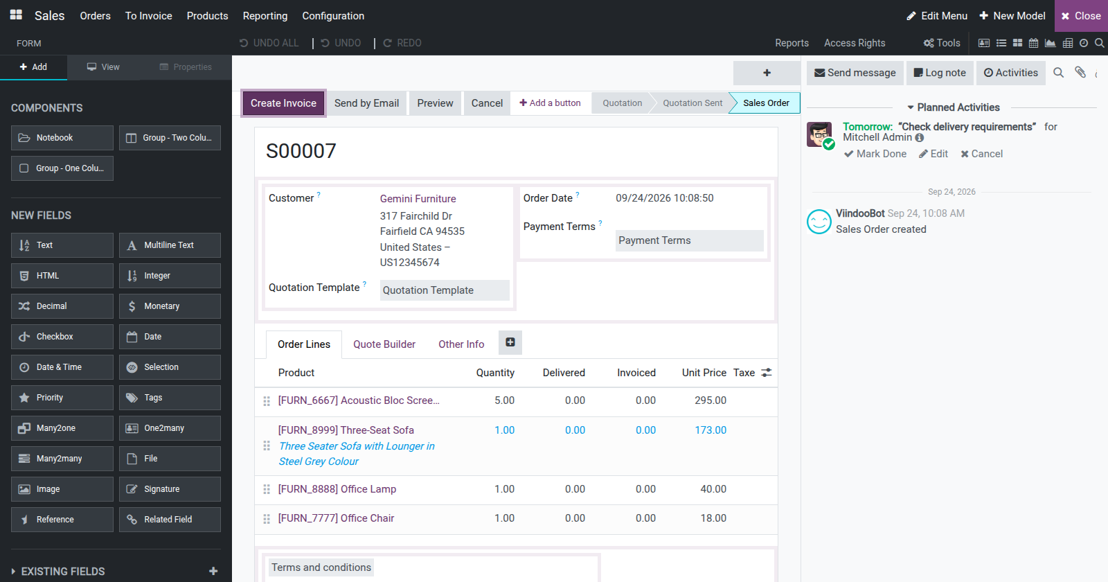
Key Features
View Switcher and Add View
Swap between every active view type instantly, or add a new one such as kanban or calendar without leaving the editor.
Kanban View Editor
Renders one live sample card so you can judge exactly how a field or a side panel, menu, ribbon or color picker will look.
New Model Creator
A two-step wizard that creates the model, its views, menu and access rights together, with optional ready-made templates.
New App Creator Wizard
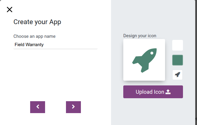
Name the app, design or upload its icon, and it appears in the Odoo apps switcher right away.
Report Layout Editor
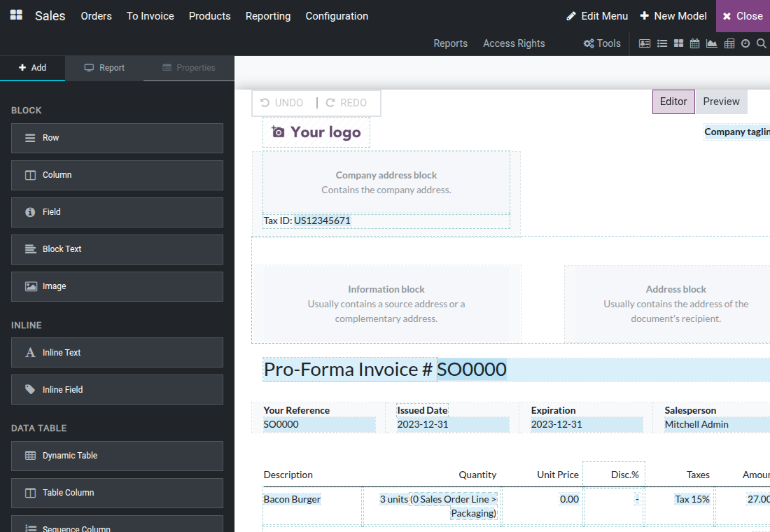
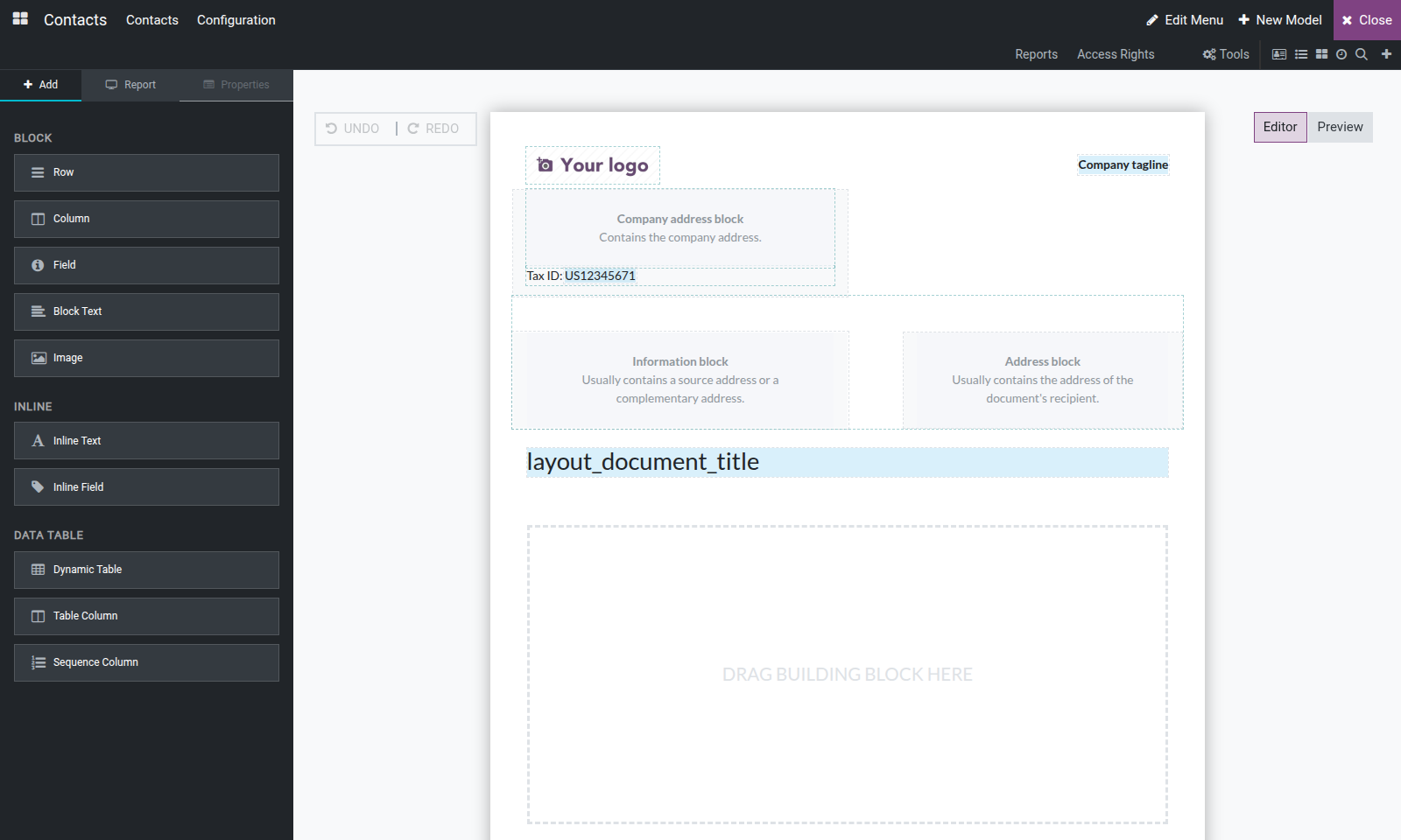
Drag rows, columns, fields, text, images and dynamic tables onto a live preview of the printed report.
Export Module
Packs everything the Customizer holds in this database into an installable module, with a notes file listing anything left out.
Why Teams Choose the Customizer
Edit on the real screen. Open Customization Mode from any screen and the editor starts on that very view. Click a field, column or button to move, relabel or remove it, and check the result against the screen your users actually work with.
Add fields in seconds. Drag a field type from the palette onto the form or list and fill in a short dialog. Text, numbers, dates, money, choices, links to other records and more are ready to use without touching a line of code.
Take your changes anywhere. Export Module packages every customization built or imported in this database as an installable module you can bring into another. A model or field that matches one already there by technical name is updated in place, not duplicated.
Every kind of screen, one editor
Form, list, kanban, search, calendar, graph, pivot and activity views can all be adjusted from the same canvas. Switch between view types without leaving the editor, add a view type the model does not have yet, and fine-tune options such as editable lists, default grouping or chart measures from the View tab. Power users can open Edit Source Code for direct XML editing, with formatting and save built in.
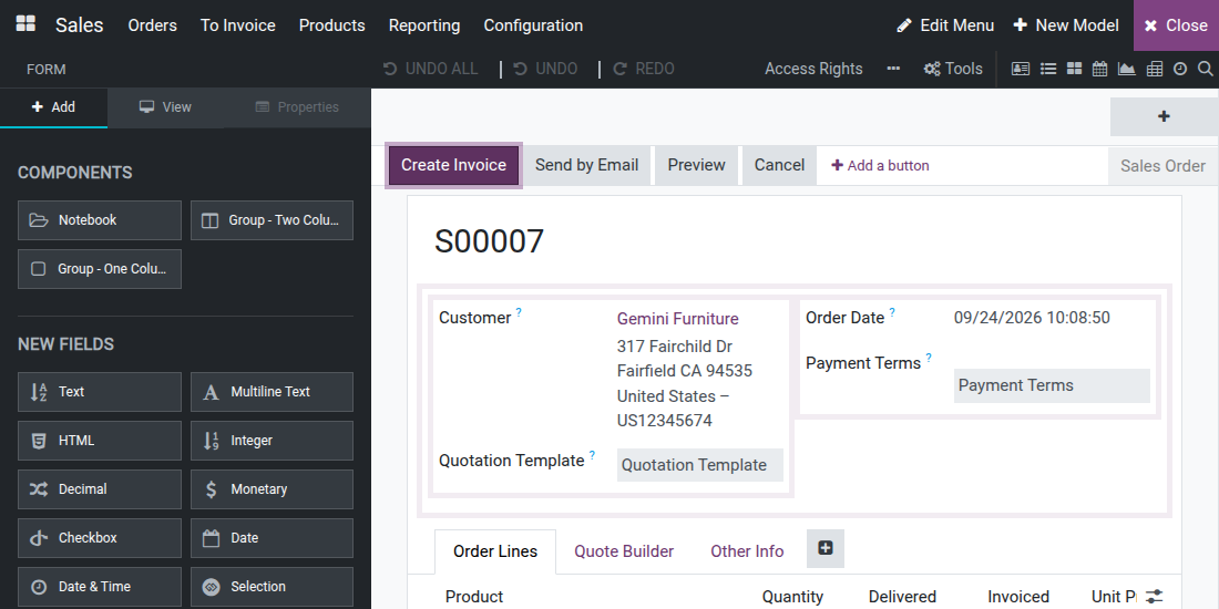
Design kanban cards visually
The kanban editor shows one live sample card, so each change is easy to judge. Drop existing fields onto the card and add structural pieces such as a side panel, a menu, a ribbon or a color picker where the card does not have one yet.
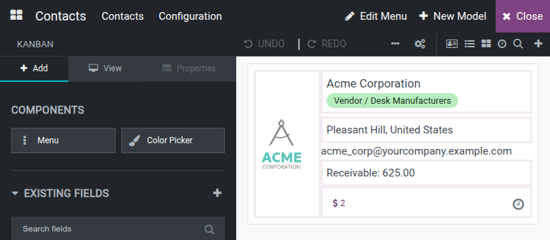
New models from ready-made building blocks
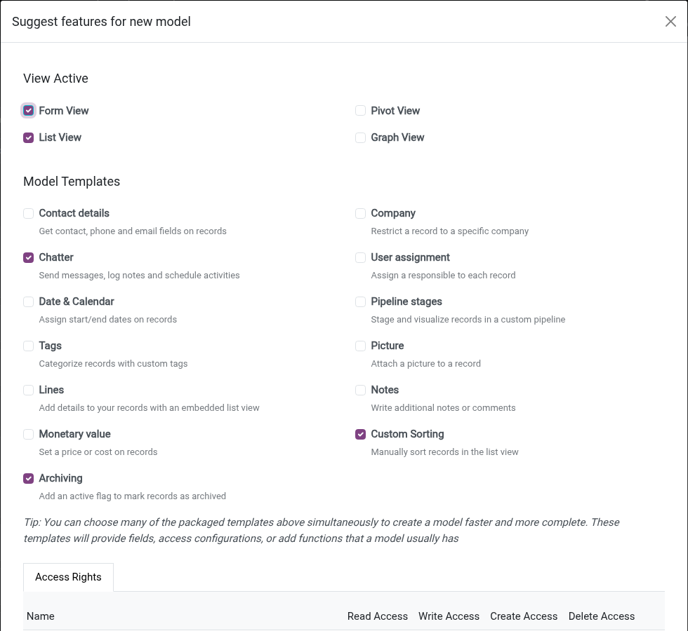
Create a model and pick the templates it needs: contact details, company with an automatic multi-company rule, chatter and activities, a responsible user, dates for a calendar, pipeline stages, tags, picture, lines, notes, a monetary amount, custom sorting and archiving. The generated form and list views, menu and access rights are ready at once, and pipeline stages, tags and responsible user work with the matching automation triggers such as "Stage is set to" and "Tag is added".
Launch a new app from a short wizard
Name the app, choose or upload its icon, name the first menu and decide whether it opens a new model or an existing one. The app appears in the apps menu right away, with the names exactly as you typed them.
Lay out printed reports visually
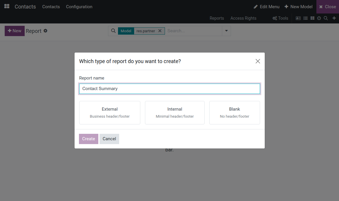
Start a report from an external, internal or blank layout, then drag rows, columns, fields, text, images and dynamic tables onto a live preview. Undo and redo freely, and switch to a print preview to check the final layout.
Respects who is editing
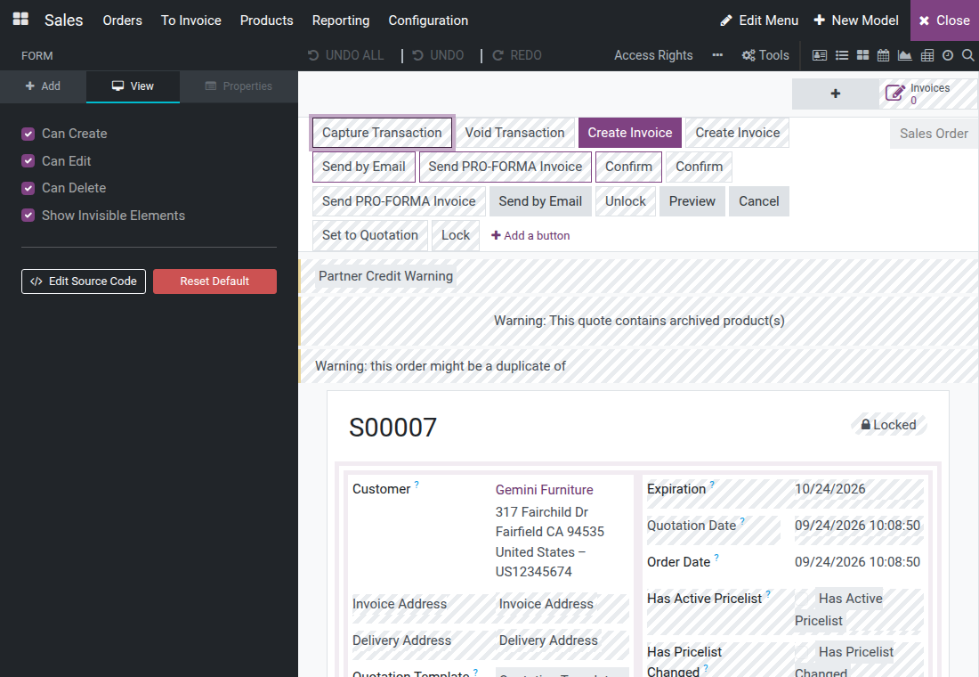
The canvas follows the same access rules as the real screen. Elements restricted to groups the editor does not belong to stay hidden and are never read; turn on "Show Invisible Elements" to see them as neutral placeholders. Saving never changes an element the editor cannot see. Menus, access rights, automations, webhooks and filter rules for the model are one click away in the same toolbar.
Export and import your customizations
Export Module packs every model, field, view, report, menu, access right, rule and automation the Customizer holds in this database, together with what they need to load, and adds a notes file listing anything left out. Importing into another database matches models and fields by technical name; with Force init selected, a match is updated in place with the imported definition rather than duplicated. Before the Customizer's data module is uninstalled, a confirmation shows how many models, fields, views and other records will be removed and recommends exporting first.
Frequently Asked Questions
Do I need to know programming?
No. Screens, fields, models, apps, menus and reports are all built from the visual editor. Direct XML editing is available for those who want it, but it is optional.
Which platforms are supported?
Odoo Community Edition and Viindoo.
Who can use the Customizer?
Users with the Administration: Settings access right. Opening Customization Mode switches on developer mode, and the editor always reflects the screen as the editing user sees it.
Can I move my customizations to another database?
Yes. Export Module packages everything built or imported with the Customizer in this database, and the standard Import Module feature loads it elsewhere. A model or field that matches one already there by technical name is updated with the imported definition, not duplicated.
Do my changes stay in place when an app is updated?
Wherever the screen gives an element a technical name - its own or that of a nearby element - a change is anchored on that name rather than on the element's position, so it stays on the right element when an update or another app adds or moves elements around it. Removing a standard element hides it instead of deleting it, so apps that build on it keep working.
What happens if I uninstall it?
Uninstalling the Viindoo Customizer app only removes the editor; every customization stays in place. Uninstalling "Viindoo Customization Data" removes everything built or imported with the Customizer - a confirmation first lists how many records of each kind will be deleted and recommends exporting first.
See Viindoo Customizer in Action
or use the Live Preview button at the top of this page
Need help with Viindoo Customizer?
For questions, implementation support or a custom feature, contact Viindoo.
Pre-Sales & Partnership
sales@viindoo.comUpgrades to a newer Odoo series are a separate purchase for that series.
All Viindoo apps: Viindoo Apps
Technical Requirement
- Odoo version: 18.0
- Platforms: Odoo Community Edition, Viindoo
- Required modules: base_automation, base_import_module, web_editor, mail
- License: OPL-1
Viindoo Customizer
Viindoo Customizer lets an administrator change forms, lists, kanban cards, menus, search filters and print reports directly on the screen being edited, without writing code. What is shown while editing is exactly what the people using that screen will see afterwards.
Installation
- Open Apps.
- Search for Viindoo Customizer.
- Click Install.
Installing Viindoo Customizer also installs the few Odoo apps it depends on, such as Discuss and Automation Rules, if they are not already installed. No further setup is required to start using it.
Configuration
Only a user with the Administration: Settings access right sees the Customization icon. To grant it, open Settings‣Users & Companies‣Users, open the user, and set Administration to Settings on the Access Rights tab.
A few behaviors apply everywhere in the Customizer, worth knowing before the first use:
- The icon is hidden on a phone screen (narrower than 768px); use a desktop browser or a tablet at least that wide.
- The canvas shows field and button labels in the source language of the screen (typically English), regardless of the interface language. Translate those labels with Odoo's standard translation feature, separately from customizing the screen.
- An element restricted to a security group the current user does not belong to stays hidden on the canvas. Turn on Show Invisible Elements (View tab) to reveal it as a placeholder that can still be selected and edited. Saving never changes an element that stays invisible to the editing user, even when another element on the same screen shares its name.
Usage
Open the Customizer
Open the screen to customize, for example Contacts‣Contacts.
In the top-right systray, click the cogs icon titled Customization Mode. The icon is enabled only when the current model and view type are supported.

Opening the Customizer switches the page into developer mode for the rest of the session. The editor then opens full-screen: a dark toolbar on top, the same screen re-rendered as a live, editable canvas, and a left panel with Add, View and Properties tabs. For a kanban view, the canvas shows a single sample card rather than the full board.
Edit a form view
Open a record's form, then start the Customizer.
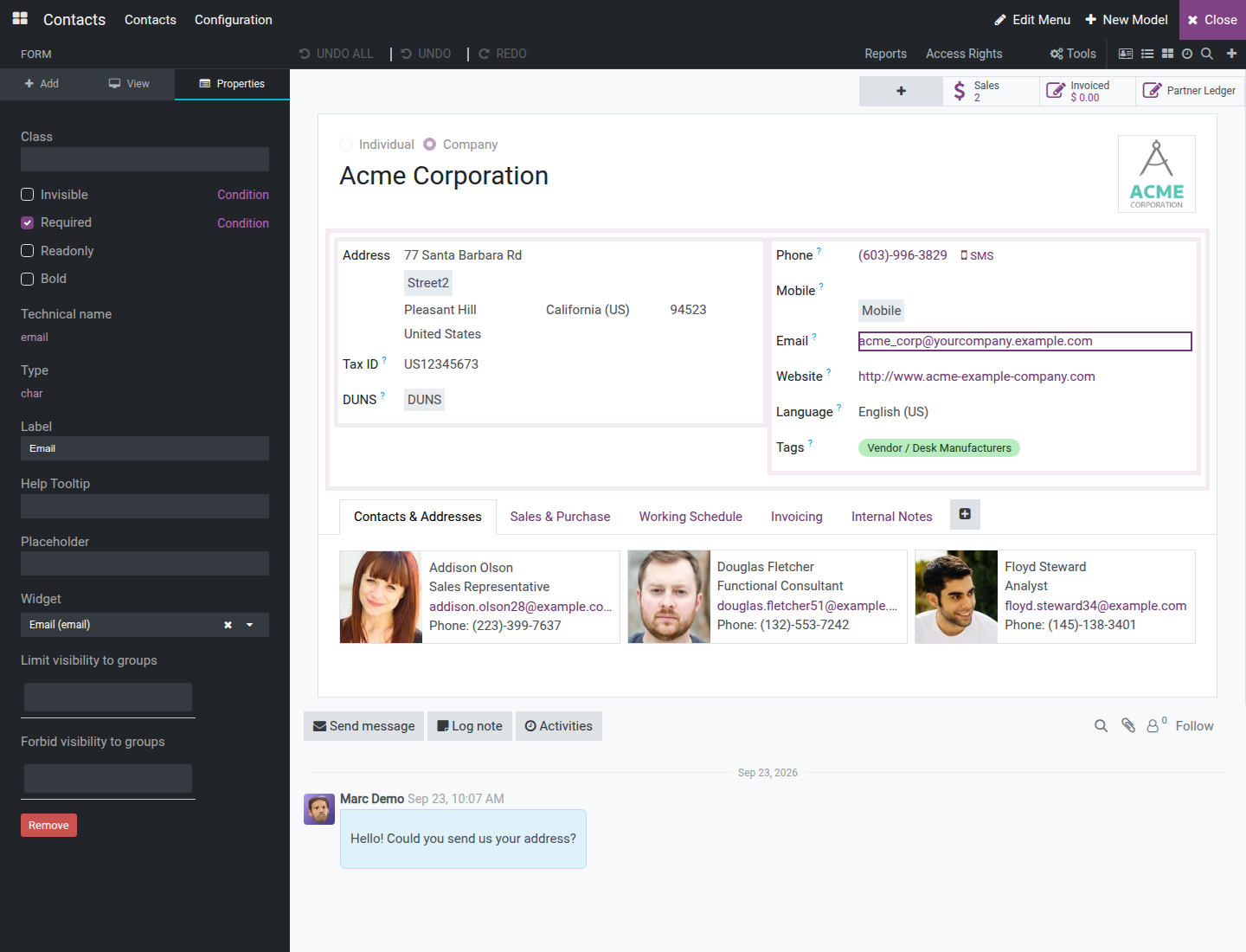
Click a field on the canvas - its value, not just its caption text. Every editable element shows a dashed outline on hover. Clicking a field's value selects it and switches the left panel to the Properties tab, showing that field's Class, Invisible (with a Condition link to make it conditional), Required, Readonly, Bold, Technical name, Type, Label, Help Tooltip, Placeholder, Widget and, for a relational field, Domain and Context. Every selected element also gets Limit visibility to groups and Forbid visibility to groups, to restrict who sees it beyond the view's own access rights. Clicking only a field's separate caption text (where the screen lays one out on its own) selects just that caption, offering its Label plus the same group-visibility controls.
Click Remove to take the field off the form, then confirm. A field that belongs to the original screen is hidden rather than deleted, so other apps that build on this screen keep working; to bring it back later, turn on Show Invisible Elements on the View tab, select the field and clear Invisible. A field you added with the Customizer is deleted. If the field is required and has no default value, the confirmation also warns that hiding it may block creating new records. The left panel then clears back to the Add tab, since nothing is selected anymore.
Click Undo (top toolbar) to bring it back, or Redo to remove it again. Click Undo All to discard every change made since the Customizer opened, after a confirmation. The canvas updates live at every step, with no page reload.
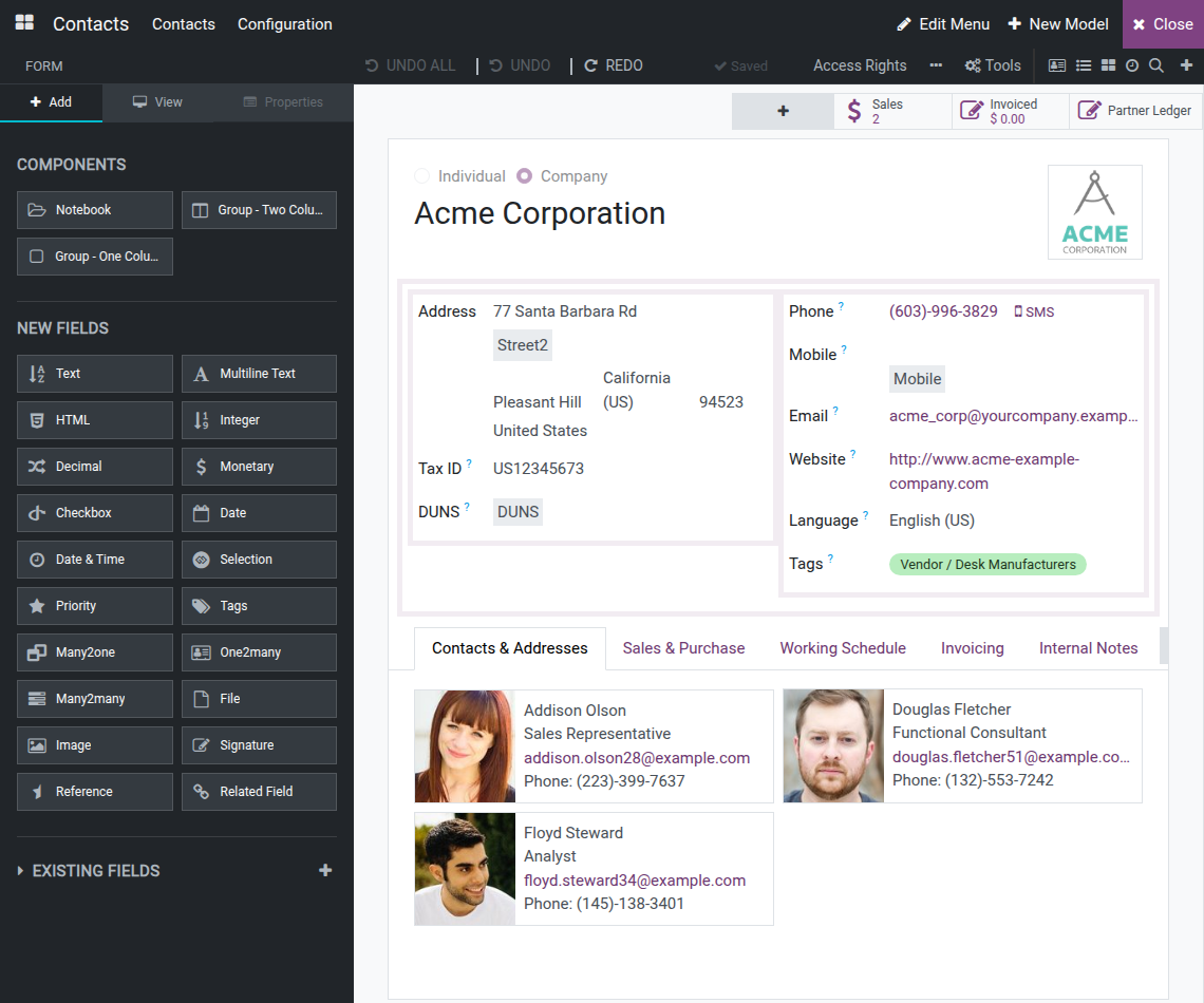
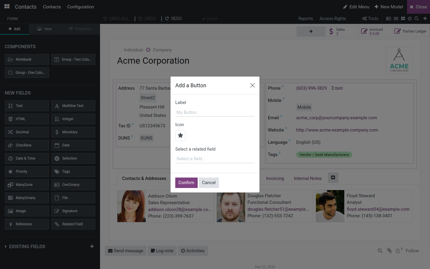
To add a smart button to the button box, click the + tile that appears before the existing stat buttons. Fill in a Label, pick an Icon and choose a related field in the Add a Button dialog, then click Confirm.
Edit a list view
Open the list, then start the Customizer.
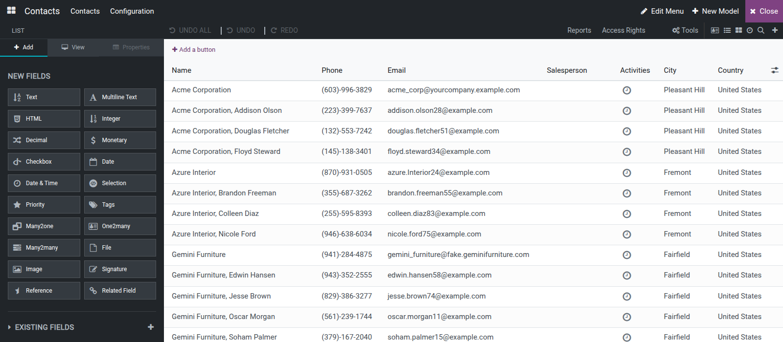
Click a column header or any cell of that column to select it. The Properties tab shows a Label box and a Remove button for that column.
Type a new value in Label to rename the column header shown to end users.
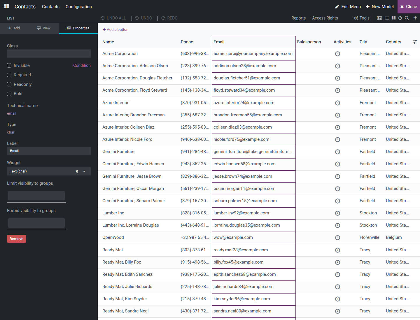
Click Remove to drop the column, then confirm. As on a form, a standard column is hidden and a column you added is deleted. Undo and Redo work the same way as on a form.
Edit a kanban view
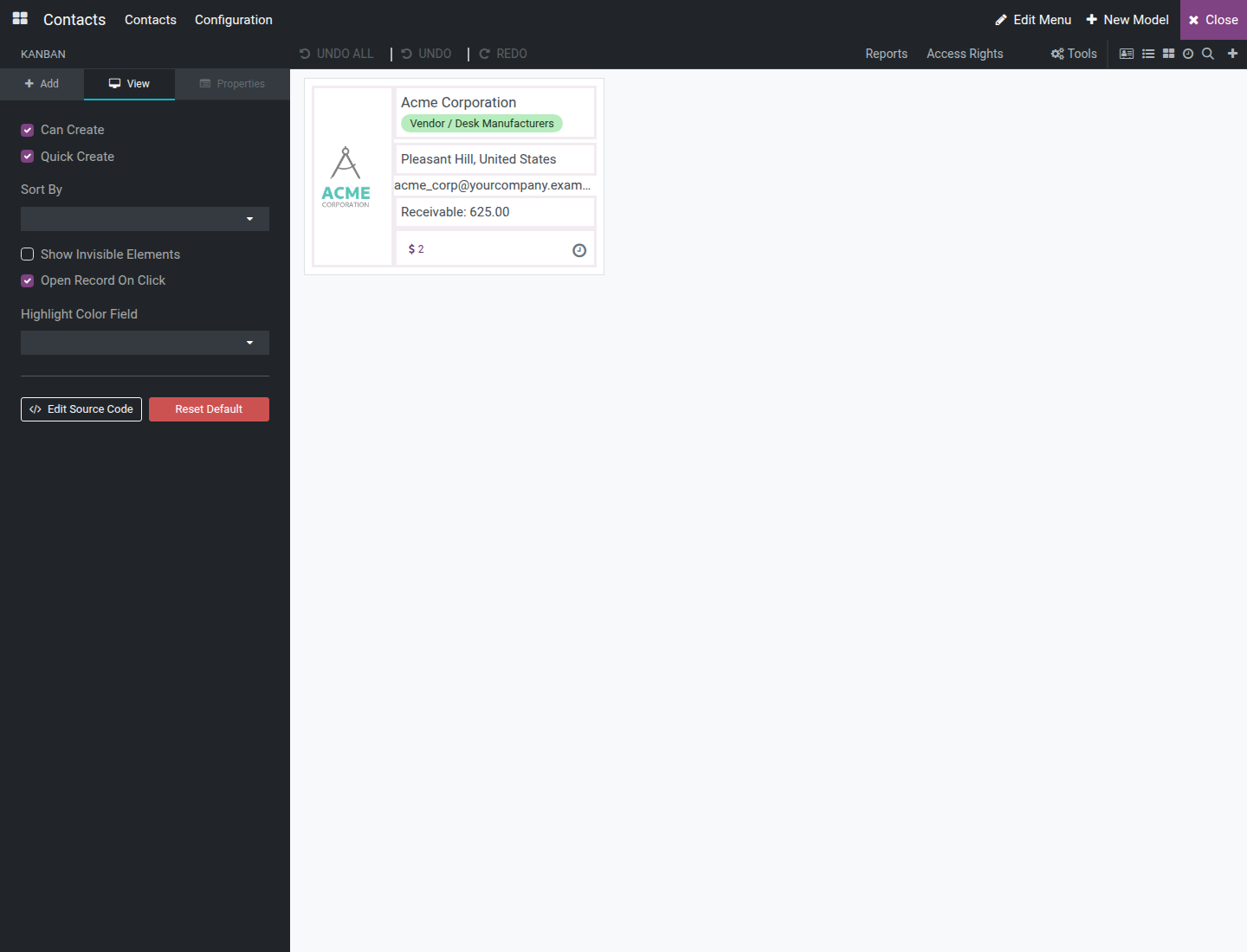
Open the kanban view, then start the Customizer. The card shown on the canvas is a single live sample record, not the full board.
On the Add tab, expand Existing Fields to see the model's fields as draggable rows, or open Components to see the four structural pieces a card can carry: Side Panel, Menu, Ribbon and Color Picker (each one only listed while the card does not already have one).
Drag an existing-field row, or a component, onto the card to place it.
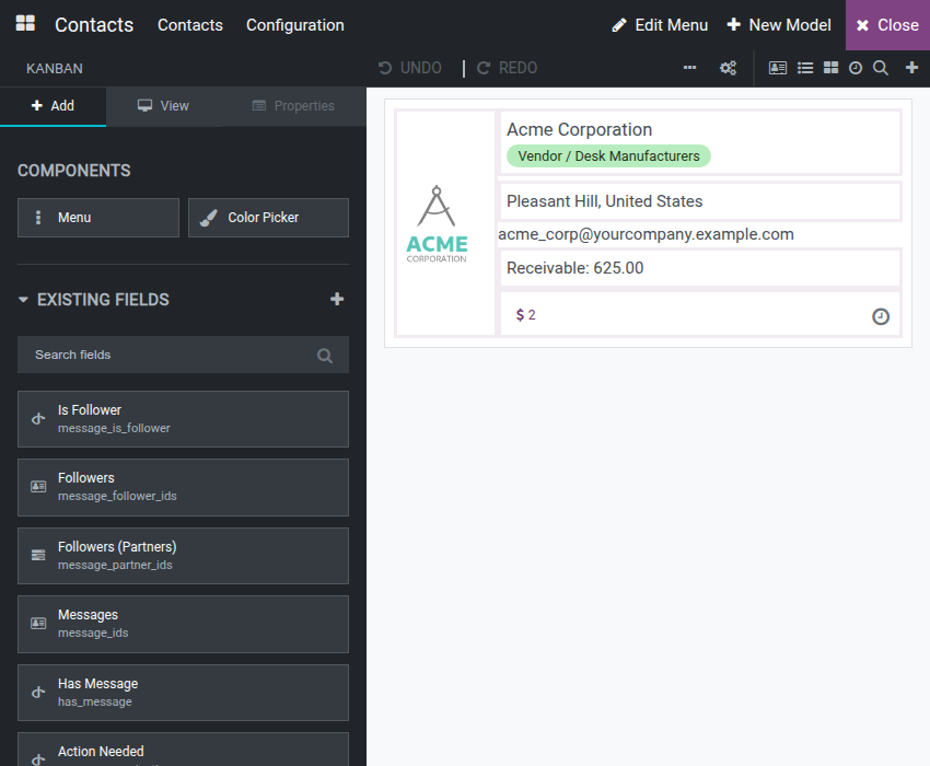
Unlike a form or list, a kanban card has no New Fields tile grid - only existing fields and the four structural components can be dropped onto it.
Control who can create, edit or delete
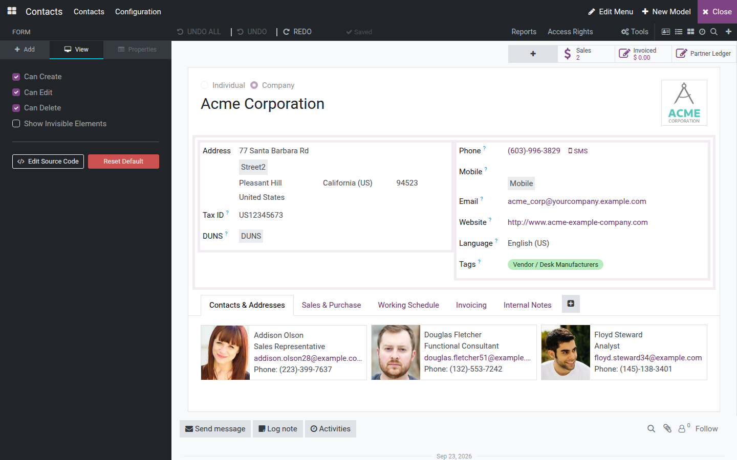
The View tab also carries record-level and display options for the view type currently open:
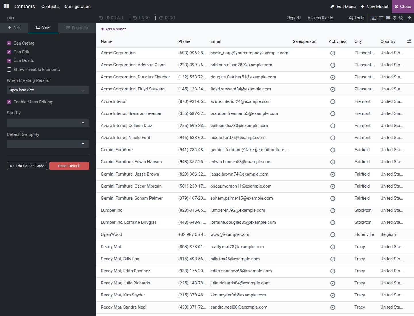
Form and List - toggle Can Create, Can Edit and Can Delete to control whether users may add, change or remove records from this screen.
List only - choose When Creating Record (how a new row opens), toggle Enable Mass Editing and, once the list is editable, Show link to record; set Sort By and Order, and a Default Group By.
Kanban only - toggle Quick Create to allow creating records straight from the board, Open Record On Click, and choose a Highlight Color Field, plus Sort By and Order.
Every view's View tab also carries Edit Source Code and a destructive Reset Default button - it discards every customization made to that view and cannot be undone with Undo, only by customizing it again.
Switch between view types
Inside the Customizer, the toolbar's view-switcher icon group (next to Reports and Access Rights) lists one icon per view type already active for the current screen. Hover an icon to see which view it opens (Form view, List view, Kanban view, and so on). Click any icon to swap the canvas to that view type instantly, without leaving the Customizer.

Add a new view type
Click the + icon at the end of the view-switcher group, titled Add view. It only appears when at least one addable view type remains.
Pick a type from the dropdown, for example Pivot.
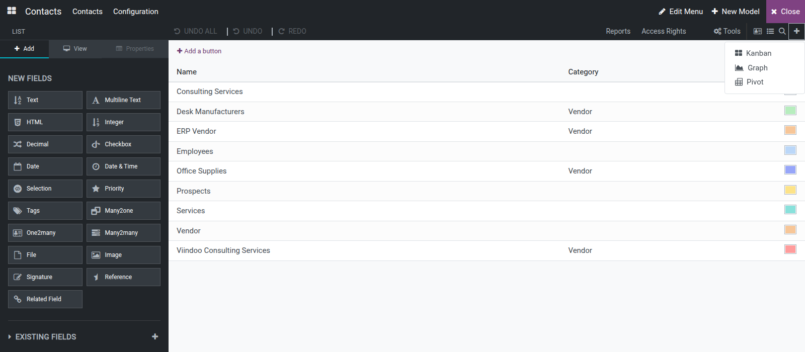
The canvas switches to the new view type immediately, seeded with sensible defaults for the model, and its icon now stays in the view-switcher row for this screen. The screen still opens on the view it opened on before; the new type is listed after the existing ones.
To take an added view type away again, switch to it, open the View tab, click Remove View and confirm. The view type and every customization made to it are removed from this screen; this cannot be undone. View types the screen came with cannot be removed this way.
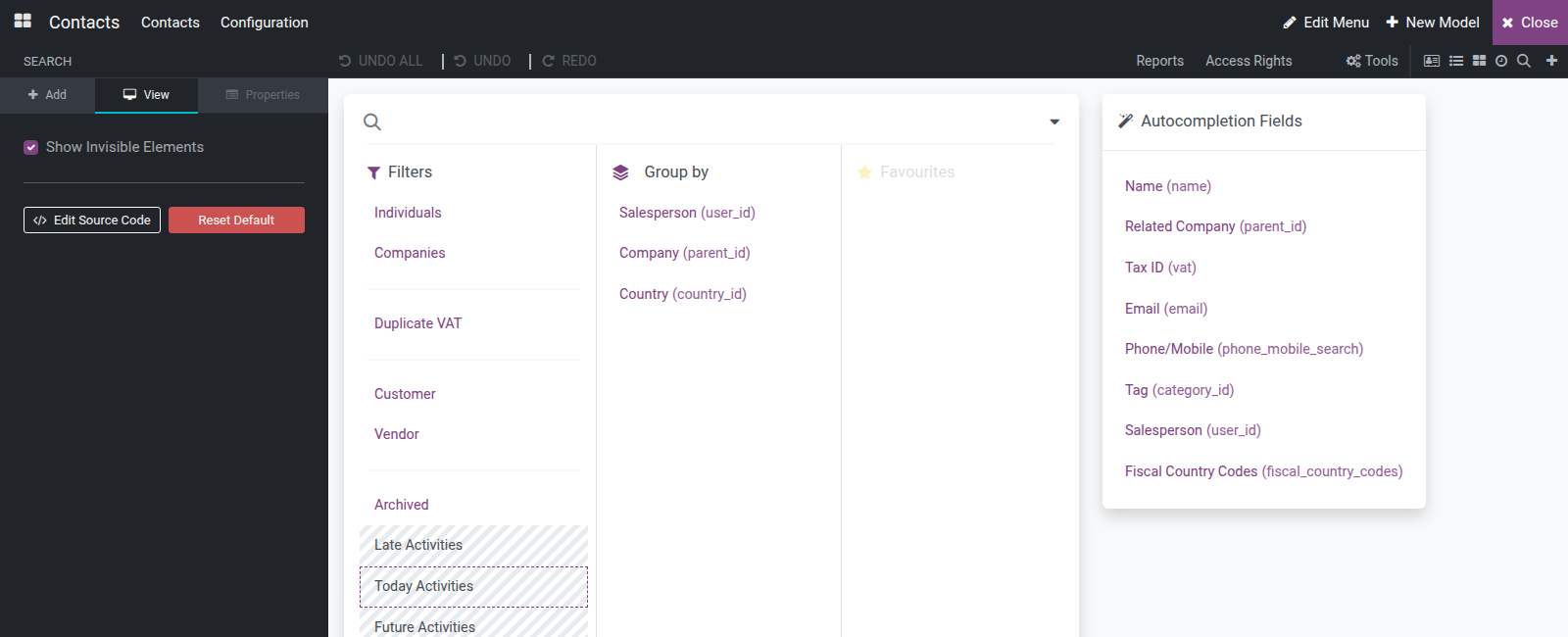
Edit the search view
In the Customizer, click the magnifier icon in the view switcher to open the search view - it cannot be added from the Add view dropdown.
On the Add tab, open Components to drag a Filter or a Separator onto the search panel, or expand Existing Fields to drag a field into the group-by or filter zone.
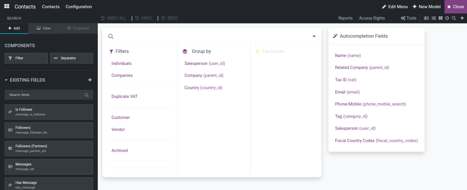
On the View tab, tick Show Invisible Elements to reveal any hidden search element directly on the canvas, so it can be selected and edited too.
Configure a Calendar, Graph, Pivot or Activity view
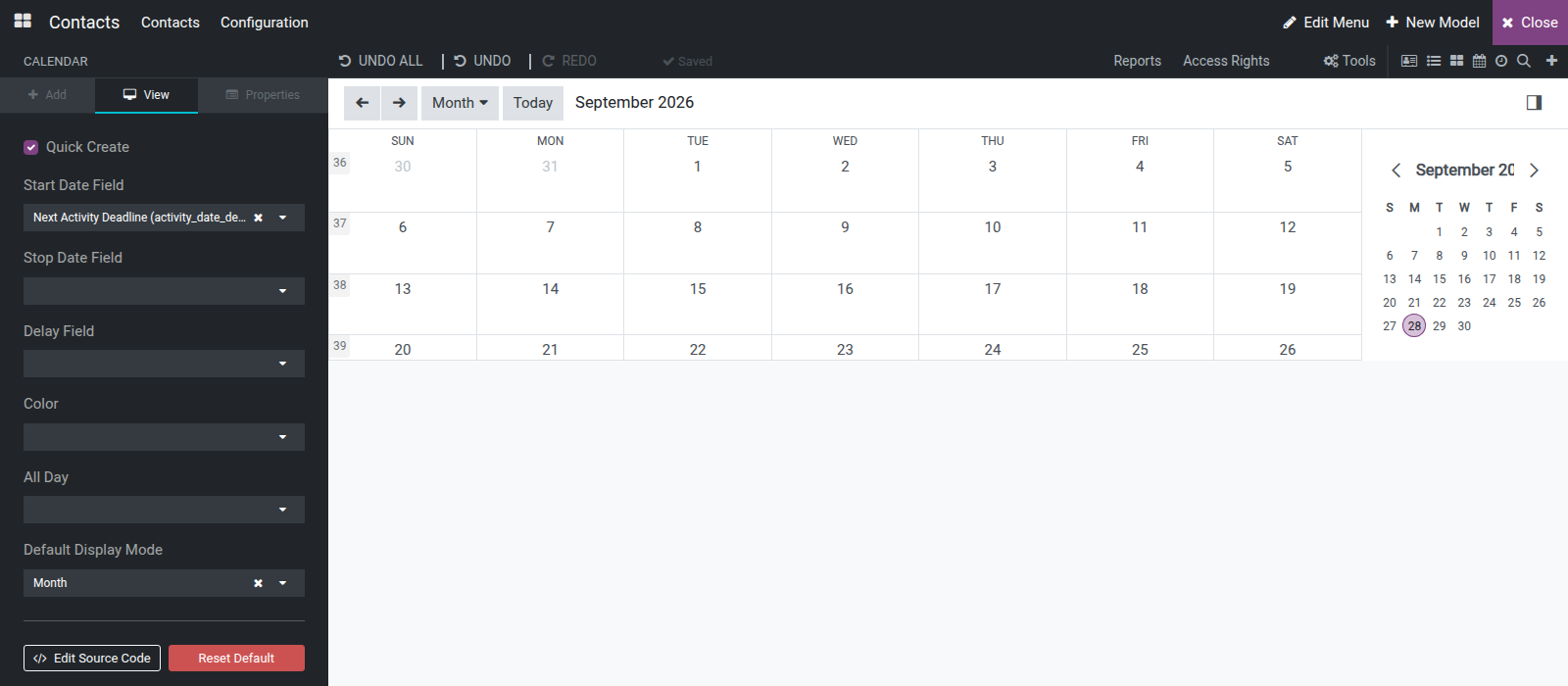
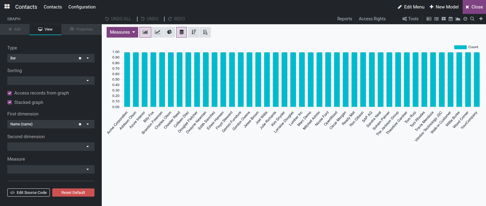
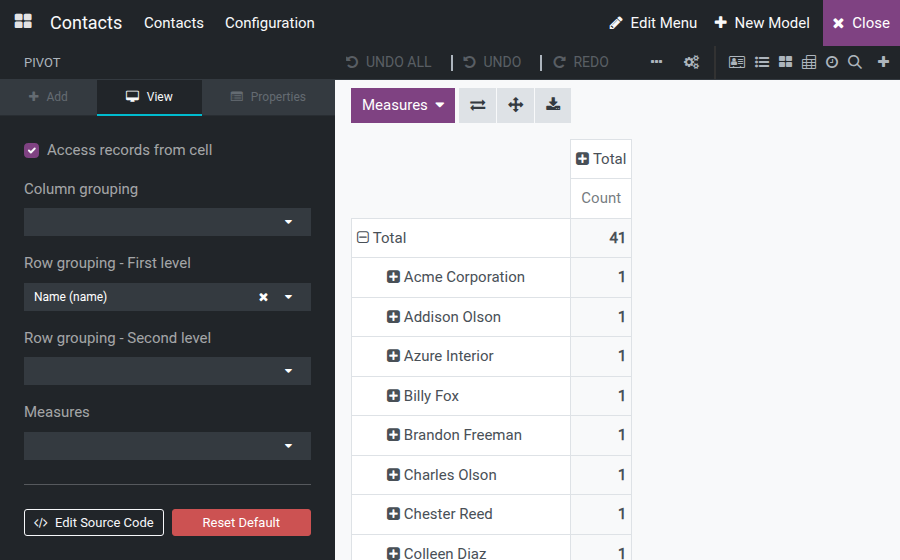
These four view types cannot be edited by clicking the canvas. Every option lives on the View tab instead:
Calendar - choose the Start Date Field, Stop Date Field, Delay Field, Color field, the All Day field, and the Default Display Mode (Day, Week, Month, Year). Toggle Quick Create to allow creating records straight from the calendar.
Graph - choose the chart Type (Bar, Line, Pie), the First and Second dimension, and the Measure. Toggle Stacked graph (hidden when Type is Pie).
Pivot - choose the Row grouping levels, the Column grouping and the Measures. Toggle Access records from cell to allow opening the underlying records from a pivot cell.
Activity - has no options of its own; its View tab offers only Edit Source Code and Reset Default, the same as every other view type.
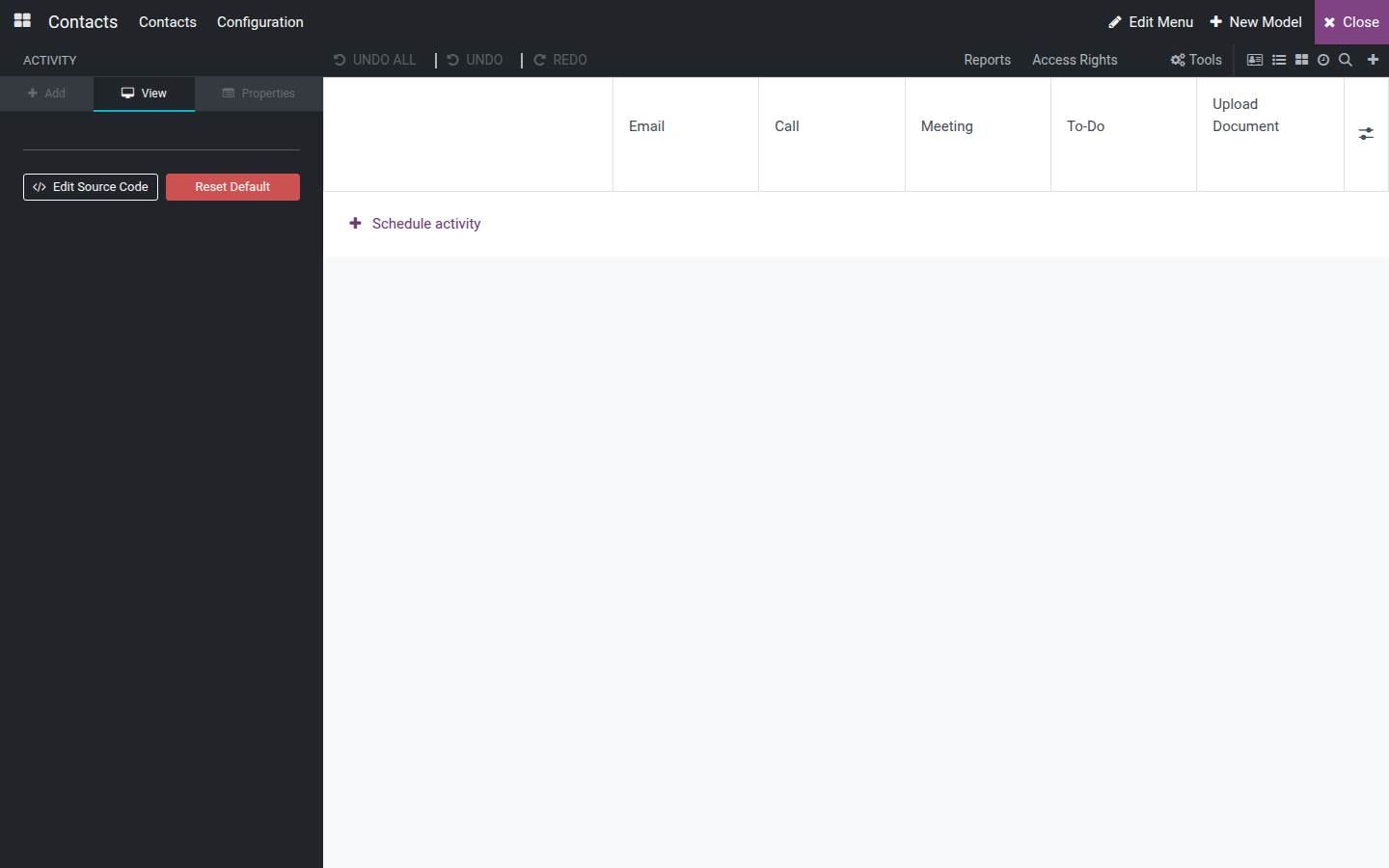
Every change on the View tab redraws the canvas immediately.
Create new fields
On a form or list view's Add tab, the New Fields tile grid offers about twenty field types - Text, Number, Date, Selection, Many2one, Related Field, Tags, Image and more. Click, or drag onto the canvas, a tile to open the Create a new field dialog.
A plain field - fill in Field Name (the box already starts with x_; keep that prefix), Field Label (what end users see) and, optionally, Field Help, then click Save & Close (or Discard to cancel). The field appears live on the canvas at the drop point.
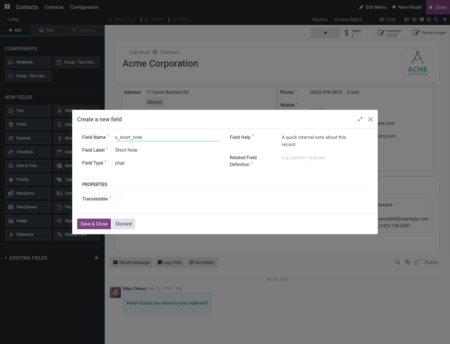
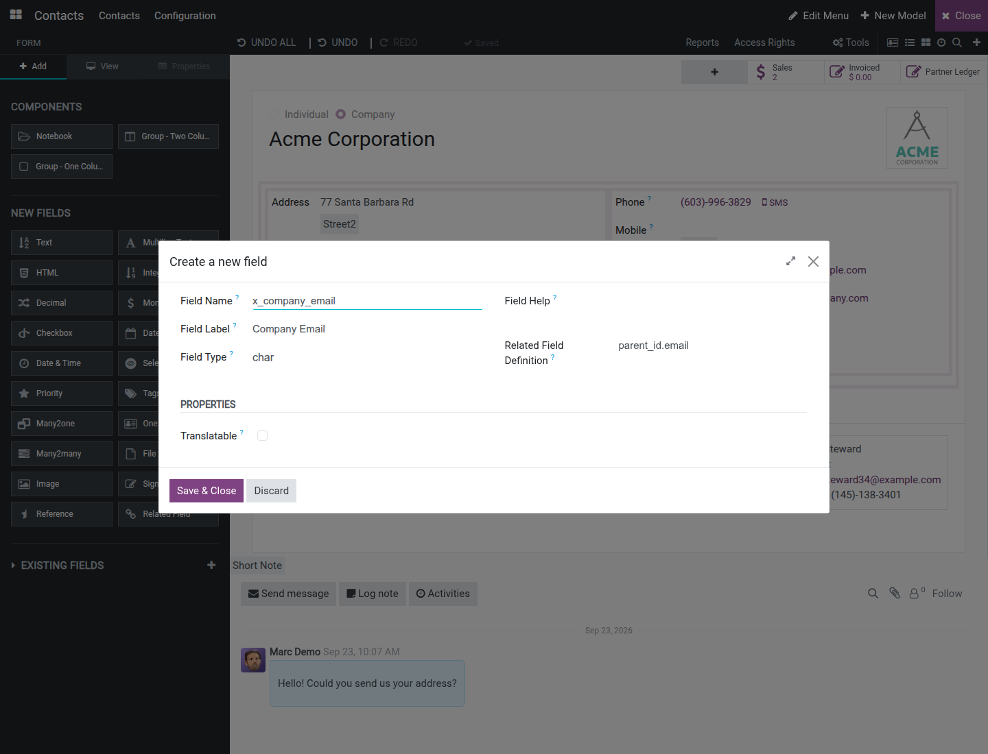
A related field - click the Related Field tile (the only one with no fixed type), fill in Field Name, then type the source path in Related Field Definition (for example parent_id.email). Odoo fills in Field Type automatically once the path is recognized - no manual type choice is needed. Field Label is required even for a related field.
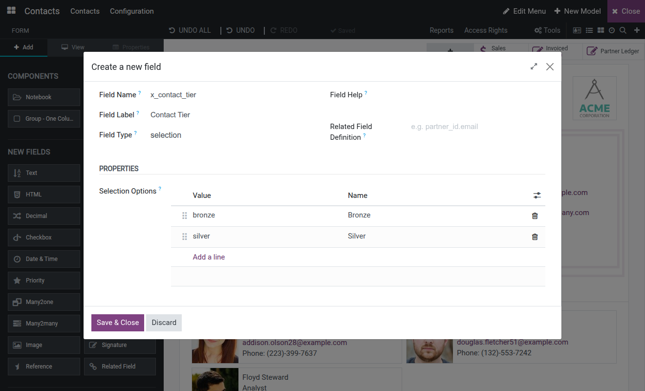
A selection field - click the Selection tile, fill in Field Name and Field Label, then click Add a line to add one Value / Name pair per option. Drag the handle to reorder options.
Create a new model
From the toolbar, click New Model (top right).
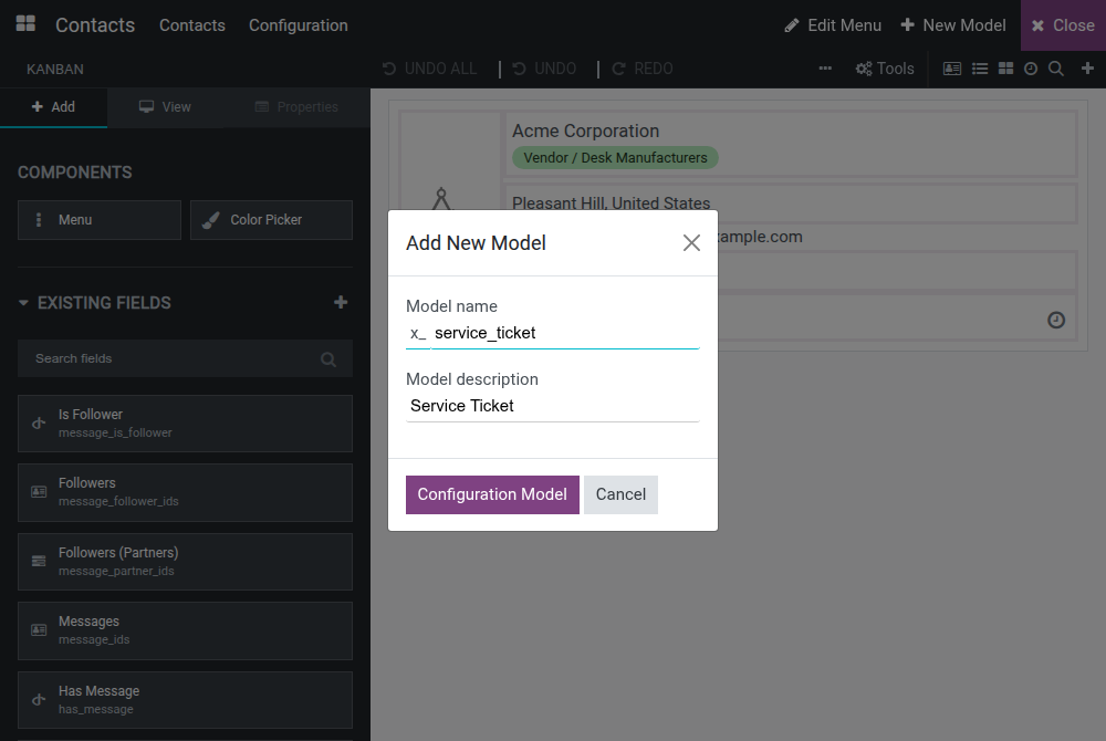
Fill in Model name (prefixed with x_) and Model description, then click Configuration Model.
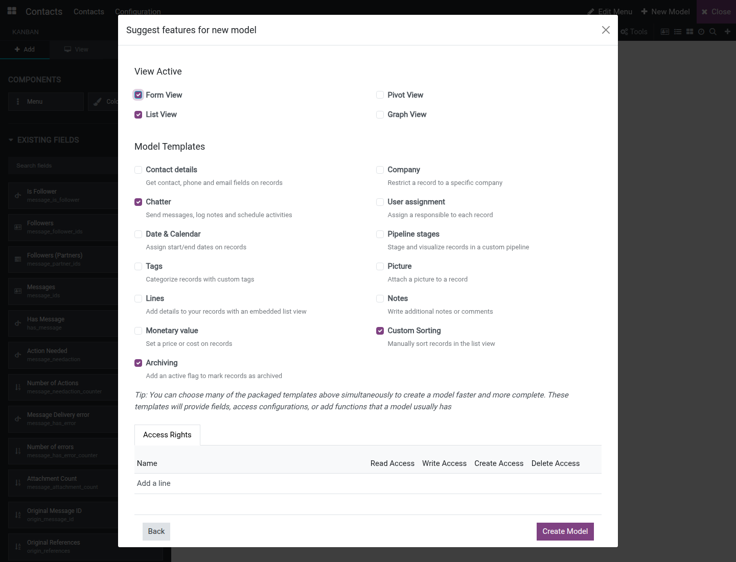
In the Suggest features for new model dialog that opens next, tick which views to generate under View Active (Form View, List View, Pivot View, Graph View) - Form View and List View are ticked by default.
Optionally tick one or more Model Templates to add ready-made fields and behavior: Contact details, Company, Chatter, User assignment, Date & Calendar, Pipeline stages, Tags, Picture, Lines, Notes, Monetary value, Custom Sorting and Archiving. Chatter, Custom Sorting and Archiving are ticked by default; untick any of them the model does not need. Picking the Company template also adds a record rule that restricts each record to its own company - a record left without a company stays visible to every company. Picking Pipeline stages, Tags or User assignment makes the new field available as a trigger ("Stage is set to", "Tag is added", "User is set") when creating an automation rule on this model afterward, unless the model also uses the Company, Contact details or Monetary value template - in that case the trigger may bind to one of those fields instead.
On the Access Rights tab, click Add a line to grant a security group read, write, create or delete access to the new model.
Click Create Model.
The Customizer opens directly into editing the new model's freshly generated view.
Create a new application
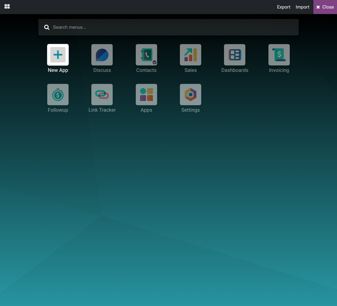
From the Apps grid (the icon at the top-left corner), click New App.
On the welcome page, click Start now.
Type the app's name and design or upload its icon.
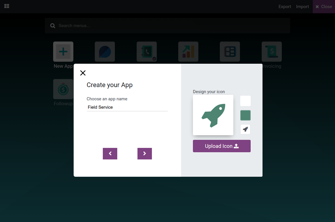
Click the arrow to advance, then type the name of the first menu's object and choose whether it opens a New Model or an Existing Model.
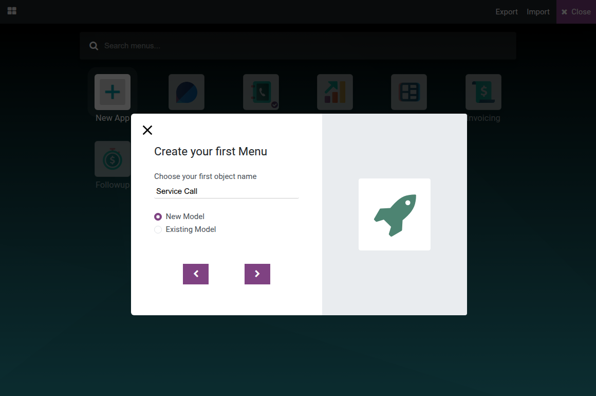
Choosing New Model opens the same Suggest features for new model dialog described above; finish it, then finish the wizard. The new app appears in the Odoo app switcher with the chosen icon, containing one menu that opens the newly created model's list and form.
Edit the application menu
From the toolbar, click Edit Menu to open the current app's full menu tree.
Click + Add a new menu item, fill in the menu form (Menu, an Action to open, plus the Access Rights and Submenus tabs), then click Save & Close - the menu item is created immediately and already appears in the real app menu, even before the tree dialog below is closed.
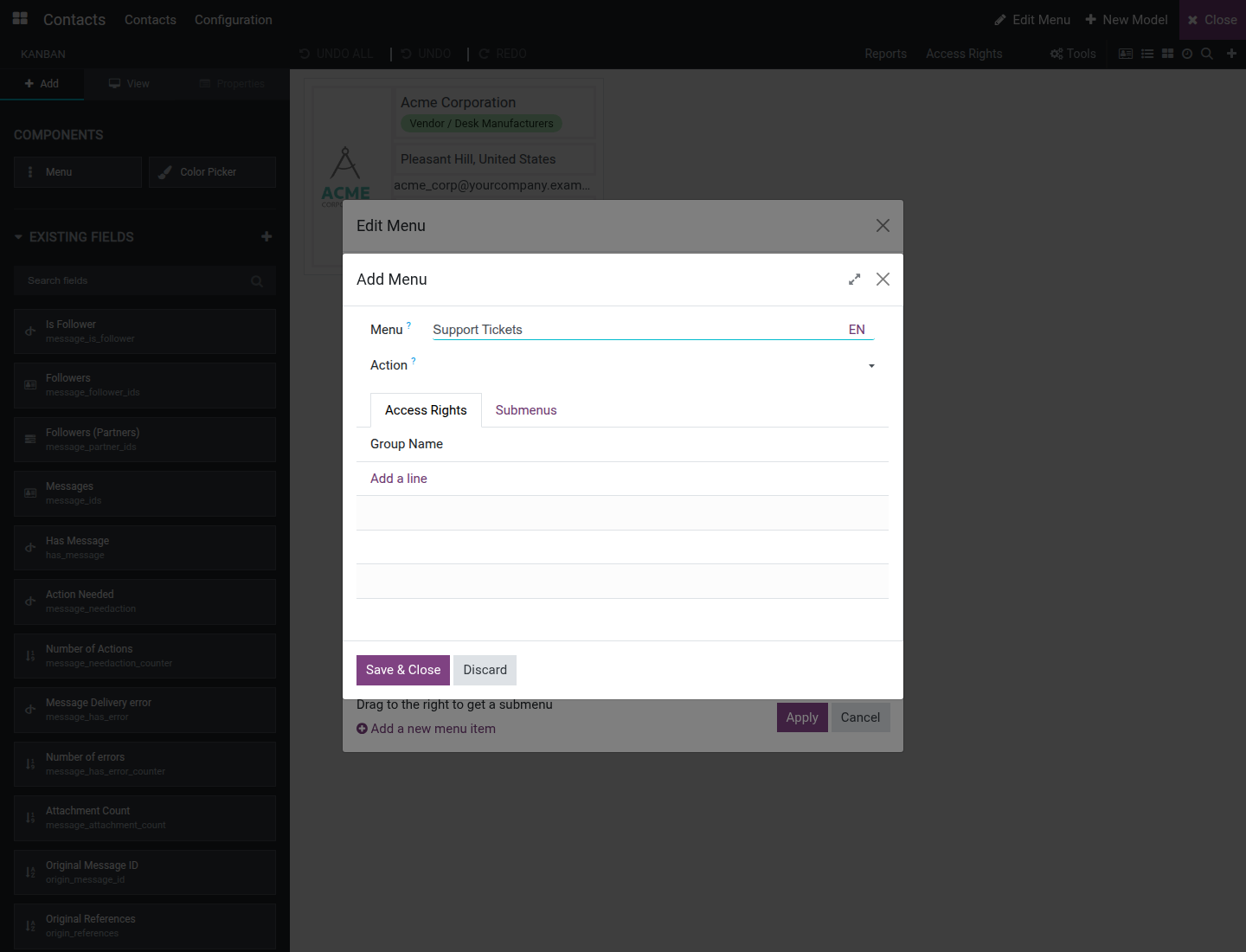
Use the pencil icon on a row to rename or edit it, and the trash icon to mark that menu and its children for deletion. Drag a row to the right to nest it as a submenu.
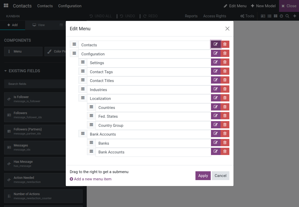
Click Apply to save the new order, the nesting and the deletions. A menu added or edited with Save & Close is saved at once - Cancel does not undo it; only the reordering and the pending deletions depend on Apply.
Create and lay out a report
From the toolbar, click Reports to open a kanban of the model's existing print reports.
Click New, type a Report name, and pick a starting layout: External (business header and footer), Internal (minimal header and footer) or Blank (no header or footer). Click Create.
The report editor opens with a live preview and a draggable block palette on the left - Row, Column, Field, Block Text, Image, Inline Text, Inline Field, Dynamic Table, Table Column and Sequence Column. Drag a block onto the report to place it; dragging Field opens a field picker.
Select a block to see its own properties instead: a DOM Structure tree, a Grid System (column Size / Offset), and Text Options (Margins, Text align, Color, Background, Font Size, Font Weight, Class, Style); selecting a field block also shows its Field Expression and Widget. The block properties have no visibility toggle - to show or hide part of a report under a condition, open the Report tab and edit the XML directly.
In the DOM Structure tree, the trash icon on a row removes that element. An element that comes with the report is hidden rather than deleted, so modules that extend the report keep working: its row stays in the tree, marked (hidden), with an eye icon (Show) that brings it back. An element you added is deleted.
On the Report tab, set the Report Name, the Paper Format, whether it appears in the print menu (Show in print menu) and whether it reloads from a saved attachment (Reload from attachment). Click More for the underlying report record, Edit Source Code to hand-edit the report's XML, or Reset Report to discard every change and start over.
Use the report toolbar's own Undo and Redo - independent from the view editor's history - and switch Editor / Preview to see a real print preview with a Print button. The preview shows a record of the report's model; use the pager to move to another one. A record that this report cannot print is reported as such instead of being shown.
If a report was built with several conditional branches (using an XML t-if/t-elif), a branch selector appears above the canvas; it only chooses which existing branch the editor currently displays, it does not create a new condition. Removing one of those branches hides it: when the report is printed, the remaining branches are checked in their usual order with their own conditions, exactly as if the removed one were not there.
Edit view source directly
On the View tab, click Edit Source Code to open a resizable side panel.
The panel shows a resource picker (a dropdown of the view's inherited resources), a code editor with the raw arch, and Format, Save and Close controls. Click Format to pretty-print the XML.
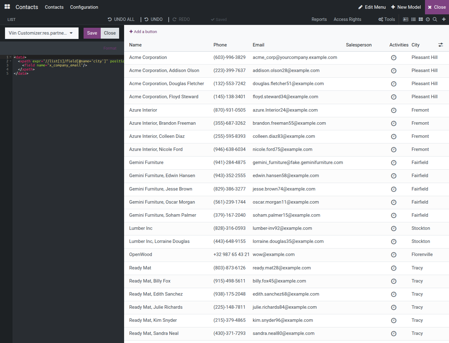
Edit the XML directly as an alternative to drag-and-drop, click Save, then Close. The visual canvas reflects the hand-typed change immediately.
Review access rights
Click Access Rights in the toolbar (on a narrow window this and other items move into the More dropdown) to open an inline-editable list of access rules for the current model, with the Name, Group and the four Read Access / Write Access / Create Access / Delete Access columns.
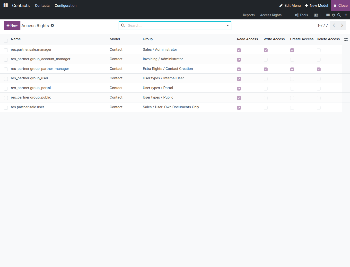
Click New, pick a Group, tick the permissions to grant, then save the row.
Review automation rules and other tools
Click Tools in the toolbar (only shown when at least one of these is available) to reach, already scoped to the current model: Automations, Webhooks, Filter Rules, Views, Model Pages - Actions and Model Pages - Menus.
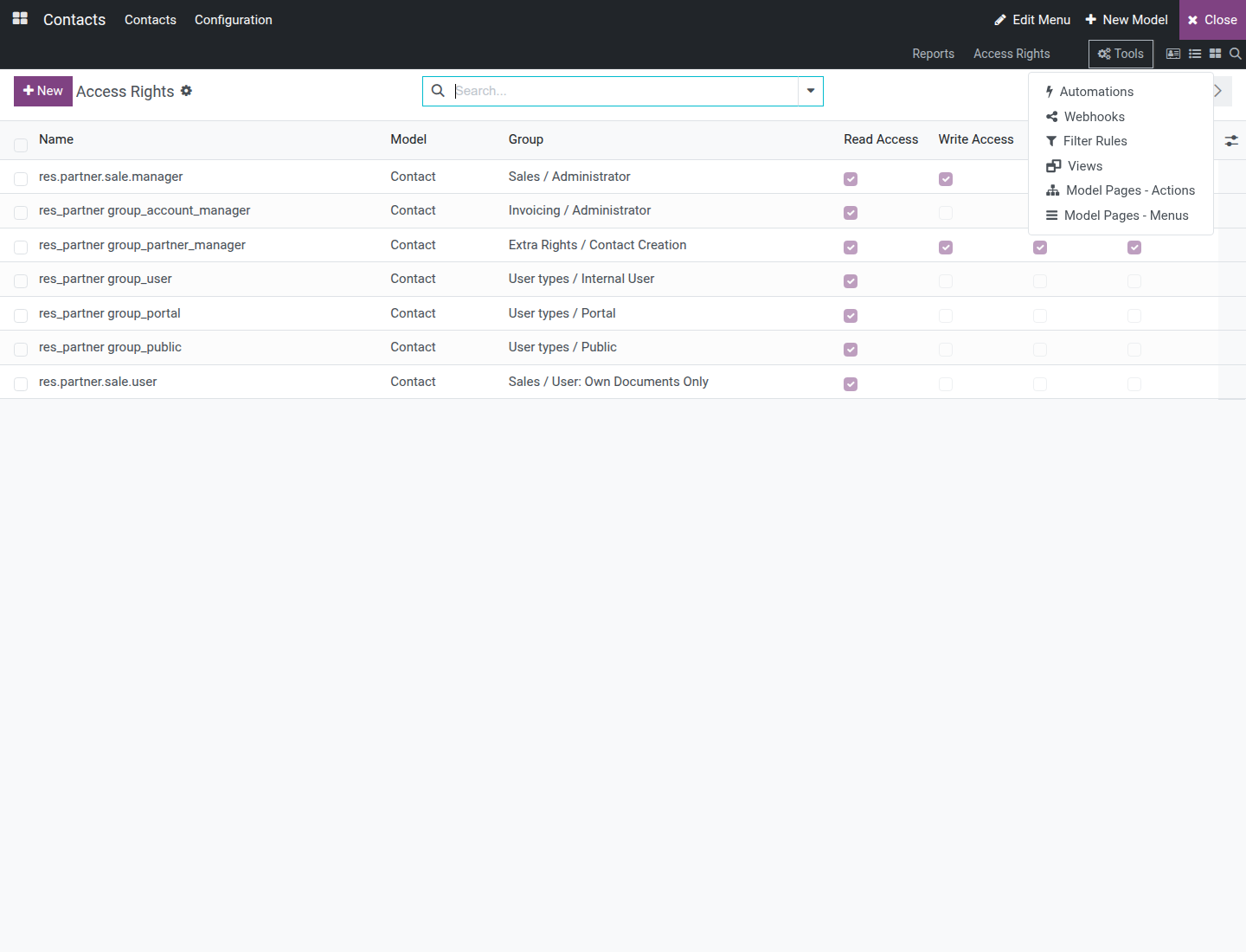
Click Automations to land on the standard Automation Rules editor, pre-scoped to the model being customized, without hunting for it under Settings‣Technical.
Export your customizations
From the Customizer's toolbar landing state (shown when no specific view is open - click the apps icon at the top-left corner of the Customizer to reach it), click Export in the top-right corner of the toolbar.
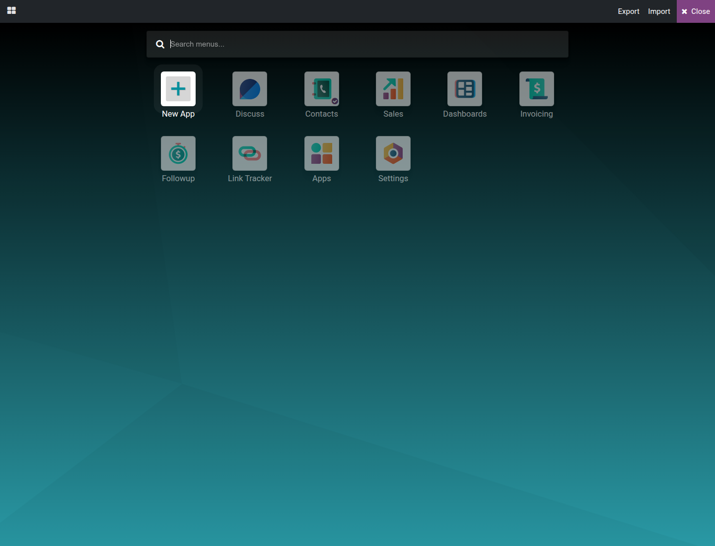
The browser downloads a .zip file: an installable Odoo module named viin_customization that packages every customization made with the Customizer in this database - new fields, view edits, new models, menus, reports, access rights, rules and automations, including customizations imported earlier - ready to install on another database. The export contains only what the Customizer created plus what that content needs to load correctly; anything left out is listed, with the reason, in an EXPORT_NOTES.txt file inside the downloaded module - open it when a customization does not appear after importing elsewhere.
Import customizations
From the same landing state, click Import to open Odoo's own Import Module wizard.
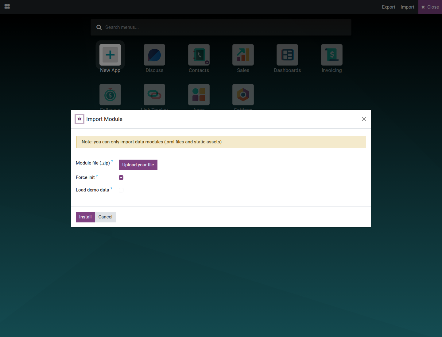
Pick the .zip file exported earlier and click Install. The module installs and its customizations become active immediately. Import matches an existing model or field by its technical name; the Force init box is ticked by default, which makes a match overwrite the existing model or field's label, help and other attributes with the imported version - untick it to leave anything that already exists untouched instead. Leave Load demo data unticked unless the imported module also ships demo records you want. Either way, a matched model or field is updated, not duplicated, and is kept in place if the imported module is later uninstalled.
Uninstall a customization
Everything made with the Customizer, and everything imported with Import, is stored in one module named Viindoo Customization Data (viin_customization). Uninstalling that module shows, before confirming, how many models, fields, views, reports, menus, actions, access rights and record rules it would delete, and recommends exporting first.
Uninstalling the Viindoo Customizer app itself does not remove any customization: they stay in Viindoo Customization Data and keep working.
Troubleshooting
- The Customization icon does not appear in the systray
- Check that the current user has the Administration: Settings access right (see Configuration above). The icon is also disabled, though still visible, when the current screen's model and view type are not supported.
- Saving a new field shows "Invalid fields: Field Label"
- Field Label is required for every field type, including a Related Field - fill it in before saving.
- Saving a new menu item shows "Invalid fields: Action"
- Pick an existing action, or create one, in the Action box before saving the menu form.
- A field or button that should be there does not show on the canvas
- It may be restricted to a security group the current user does not belong to. Turn on Show Invisible Elements (View tab) to reveal it as a placeholder.
- A drag-and-drop from the Add tab does not seem to place anything
- Drop the item on the exact zone the field or component belongs to (for example, inside the highlighted drop area, not on plain canvas background), then check the Properties tab to confirm it landed where expected.
- Opening a report shows "This report no longer exists."
- The report was deleted - by another user, or through Reset Report in another tab - while this tab was still pointing at it. Nothing on the screen can be edited or saved anymore. Close it and reopen Reports from the toolbar to pick a report that is still there.
FAQ
- Does the Customizer work on a phone or tablet?
- Not on a phone: the icon is hidden below 768px of screen width. It works on a desktop browser or a tablet at least that wide.
- Does the Customizer translate my screens into other languages?
- No. The canvas always shows labels in the source language of the screen. Translate a screen with Odoo's standard translation feature, separately from customizing it.
- What happens to my customizations if I uninstall Viindoo Customizer?
- They keep working. Customizations live in the Viindoo Customization Data module, not in the Customizer app. To remove them, uninstall Viindoo Customization Data - export first if you may need them again.
- Can I move my customizations to another database?
- Yes. Use Export to download an installable module, then Import it on the other database.
- Do my changes stay in place when an app is updated?
- Wherever the screen gives an element a technical name - its own or that of a nearby element - a change is anchored on that name rather than on the element's position, so it stays on the right element when an update or another app adds or moves elements around it. Removing a standard element hides it instead of deleting it, so apps that build on it keep working.
- Which platforms is Viindoo Customizer supported on?
- Odoo Community Edition and Viindoo.
This software and associated files (the "Software") may only be used (executed, modified, executed after modifications) if you have purchased a valid license from the authors, typically via Odoo Apps, or if you have received a written agreement from the authors of the Software (see the COPYRIGHT file).
You may develop Odoo modules that use the Software as a library (typically by depending on it, importing it and using its resources), but without copying any source code or material from the Software. You may distribute those modules under the license of your choice, provided that this license is compatible with the terms of the Odoo Proprietary License (For example: LGPL, MIT, or proprietary licenses similar to this one).
It is forbidden to publish, distribute, sublicense, or sell copies of the Software or modified copies of the Software.
The above copyright notice and this permission notice must be included in all copies or substantial portions of the Software.
THE SOFTWARE IS PROVIDED "AS IS", WITHOUT WARRANTY OF ANY KIND, EXPRESS OR IMPLIED, INCLUDING BUT NOT LIMITED TO THE WARRANTIES OF MERCHANTABILITY, FITNESS FOR A PARTICULAR PURPOSE AND NONINFRINGEMENT. IN NO EVENT SHALL THE AUTHORS OR COPYRIGHT HOLDERS BE LIABLE FOR ANY CLAIM, DAMAGES OR OTHER LIABILITY, WHETHER IN AN ACTION OF CONTRACT, TORT OR OTHERWISE, ARISING FROM, OUT OF OR IN CONNECTION WITH THE SOFTWARE OR THE USE OR OTHER DEALINGS IN THE SOFTWARE.